If your familiar with Emepic Graphic Design then you know I am very passionate about logo design and business branding, it’s an essential part to give you that head start to stand out of the crowd. Maintaining this professional image through easy to recognise branding is key to getting the clients calling!
Your logo and other designed stationary should represent you and your business in a way that it can be easily seen as yours and the business you make. First impressions are essential for the success of any business and it’s definitely an investment worth making.
Key tips to keep in mind when creating a logo with your designer –
KEEP IT SIMPLE
Less is most of the time more! A logo that’s got simple lines and isn’t over-crowed allows for quick and easy recognition and allows the logo to be more adaptable and memorable for potential clients.
Nike Logo – Simple Effective and most of all memorable.
MAKE IT MEMORABLE
Similar to keeping it simple is memorability. To achieve this is to have a simple yet genre/business field appropriate logo. Selective colours that compliment each other can also make or break your brand. Shapes and colours help a person remember you and your brand.
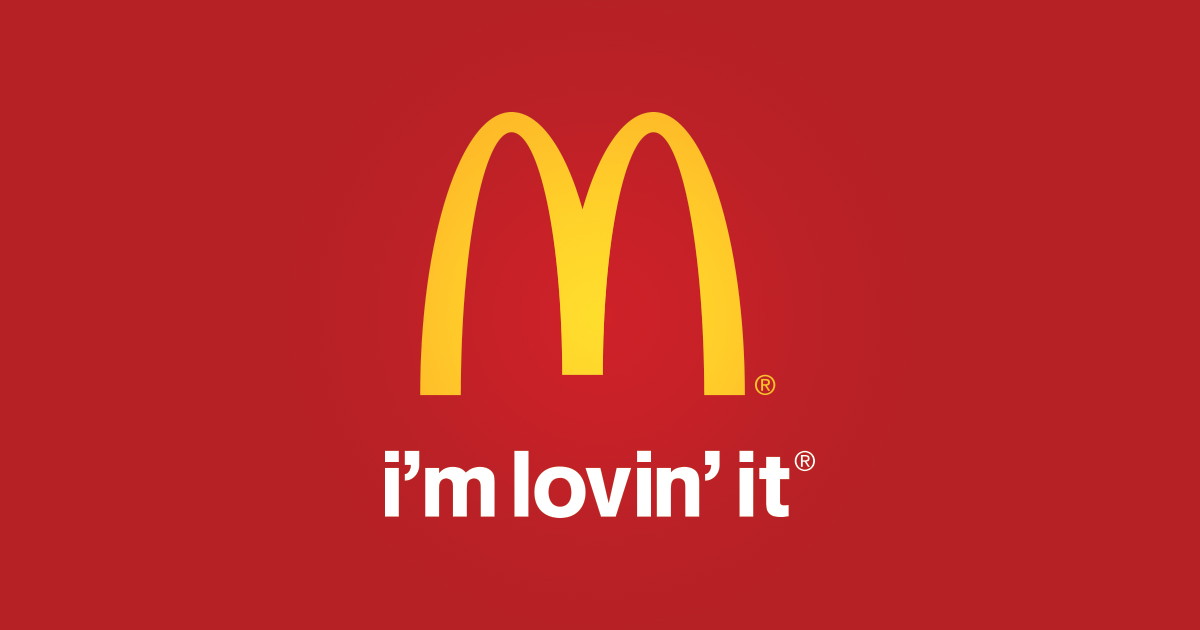
You don’t need the word McDonalds to know what these golden arches stand for!
TIMELESS AND EVOLVING
It’s hard to say today, that a logo designed now is something that will still look great in 30 years, In saying that though your logo should be adaptable and able to evolve keeping a similar look with a more in trend look. Ask yourself will it still be as effective and look good in 10, 20, 30+ years time?
VERSATILE
Your logo should be able to work across a range of mediums and different applications. The logo should be efficient it’s best to make sure when getting a logo designed you will be receiving it vector format, this ensures that it can be scaled to any size you need.
Questions to ask yourself, is a logo still effective if:
Printed in one colour?
Printed on the something the size of a postage stamp?
Printed on something as large as a billboard?
Printed in reverse (ie. light logo on dark background)?
When I am creating a logo I get a brief from the client of what they have in mind for their brand ie: colours, feelings, fonts, inspiration and other ideas. To start off I sketch a few things and then I first design the logo in black and white this allows me to concentrate on the shape and impression of the logo in a simple form to make sure it’s going work with all the reasons I mentioned above. An interesting read about selections of colour and the emotions and sensations it brings out.
http://www.logocritiques.com/resources/color_psychology_in_logo_design
![]()
APPROPRIATE
Where you place and position a logo should be appropriate for its planned purpose. Who is your target audience and what feelings and emotions would you like to evoke on them?
If your creating a logo for a corporate firm then you wouldn’t use the front Comic Sans because its not professional. Actually in-fact please don’t use Comic Sans EVER, it’s a pet hate of mine.
It is also important to keep in mind that a logo doesn’t need to show what a business offers or is selling. For example do you know of any large Car manufactures that have a car in their logo? No. A logo is purely for identification and can even entice a client into finding out more about your company.
I’d love to hear your feedback what do you think creates a good logo, comment below?
Just remember great branding is an investment worth making! To talk to me your Brisbane based Graphic Designer about working with you to create a brand you will love, contact Emma on hello@emepic.com.au or 0437 216 742.

Emepic – Graphic Designer Brisbane
For more reading about logo design and what not to do –
Why professional logo design does not cost $5.00